Building a healthier financial ecosystem
Payitoff
Brand Strategy, Brand Identity
Who
Payitoff's mission is to create a balanced borrower ecosystem that helps millions of Americans achieve extraordinary financial outcomes. Their first focus is student loan debt.
What
We were asked to revamp the Payitoff brand so that it demonstrates the impact of Payitoff’s technology and expresses the spirit of the team.
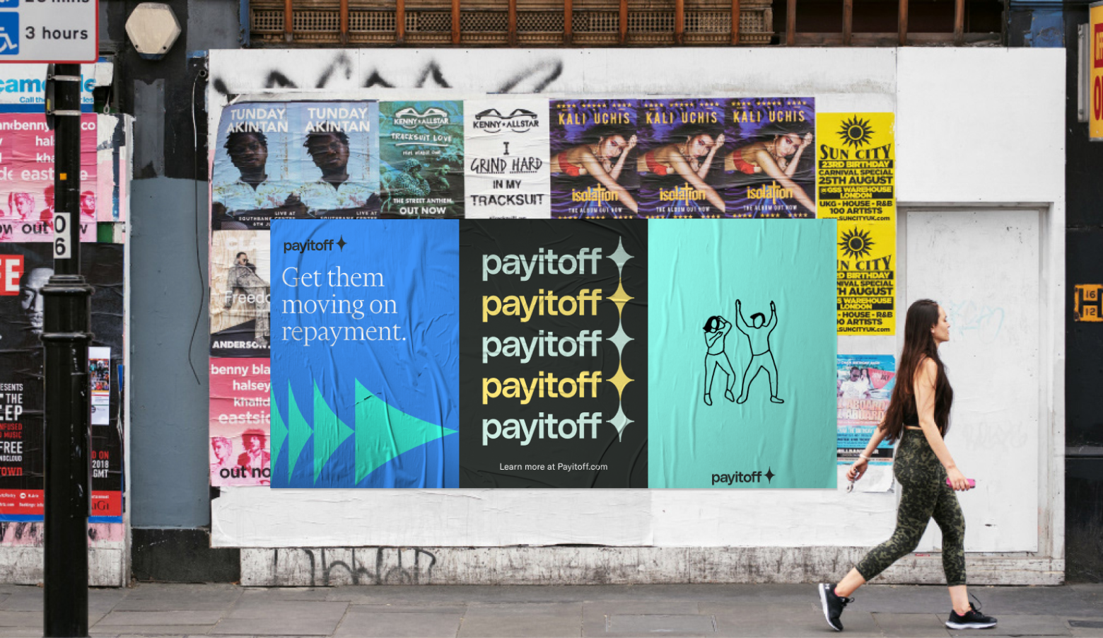
Student loan debt is the single greatest financial burden for Americans today. Starting a family, buying a home, or taking out a new business loan is overwhelming or impossible with tens or hundreds of thousands of dollars of lingering debt.
That’s where Payitoff comes in: their technology automates every aspect of student loan management for fintechs, workplace providers, and financial institutions so that borrowers can get on a swifter path to financial freedom.
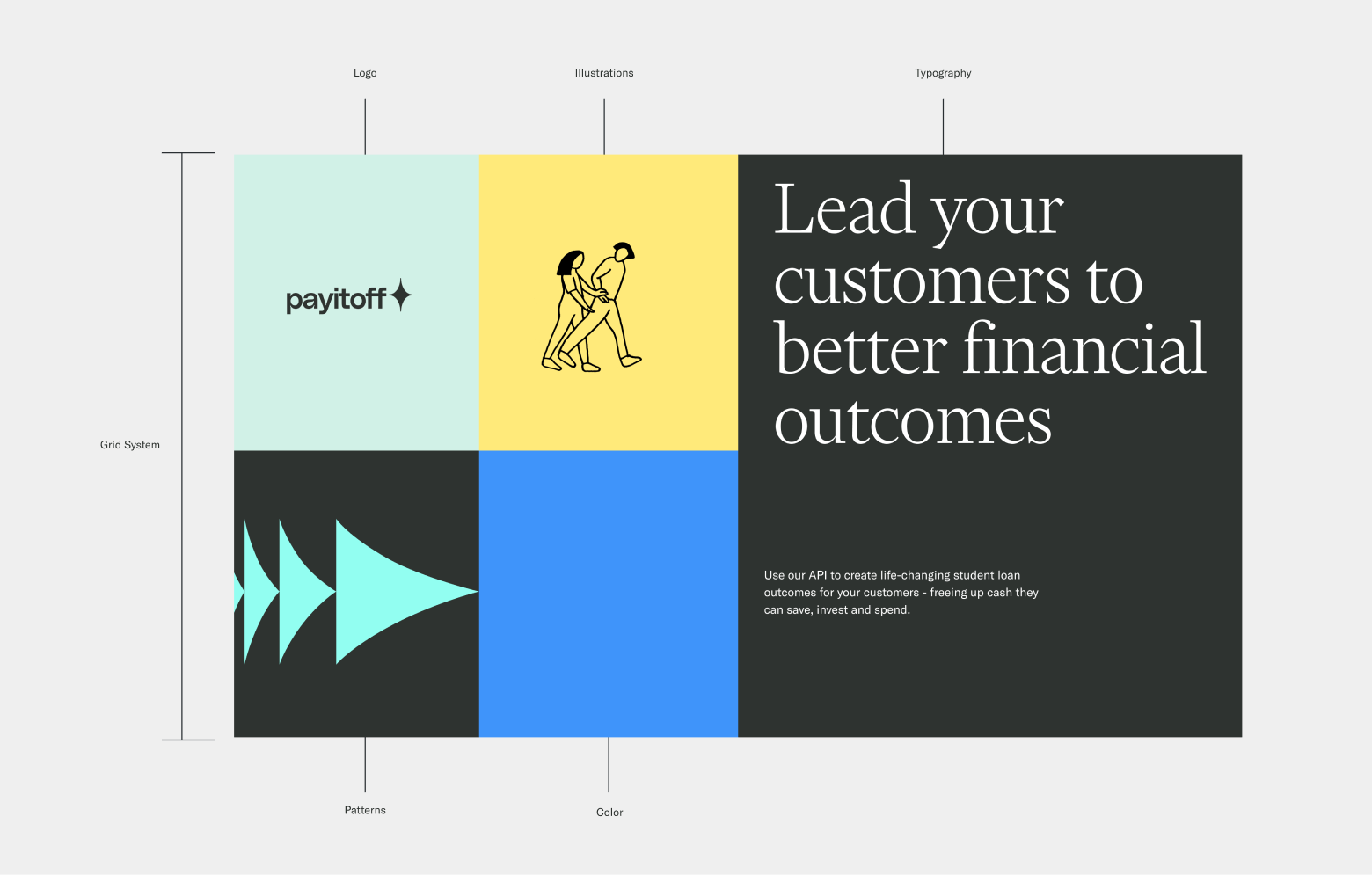
We kicked off research and workshops with their team and rallied around a new vision statement, newly articulated values, and four key brand attributes. The team wanted a brand that felt trustworthy, second-to-none, charismatic, and audacious.
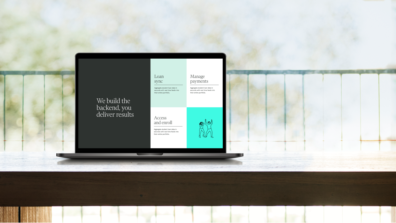
The brand is designed around 6 core elements: a celebratory logo, sturdy type, bold color, delightful illustrations, energizing patterns, and a foundational grid system.
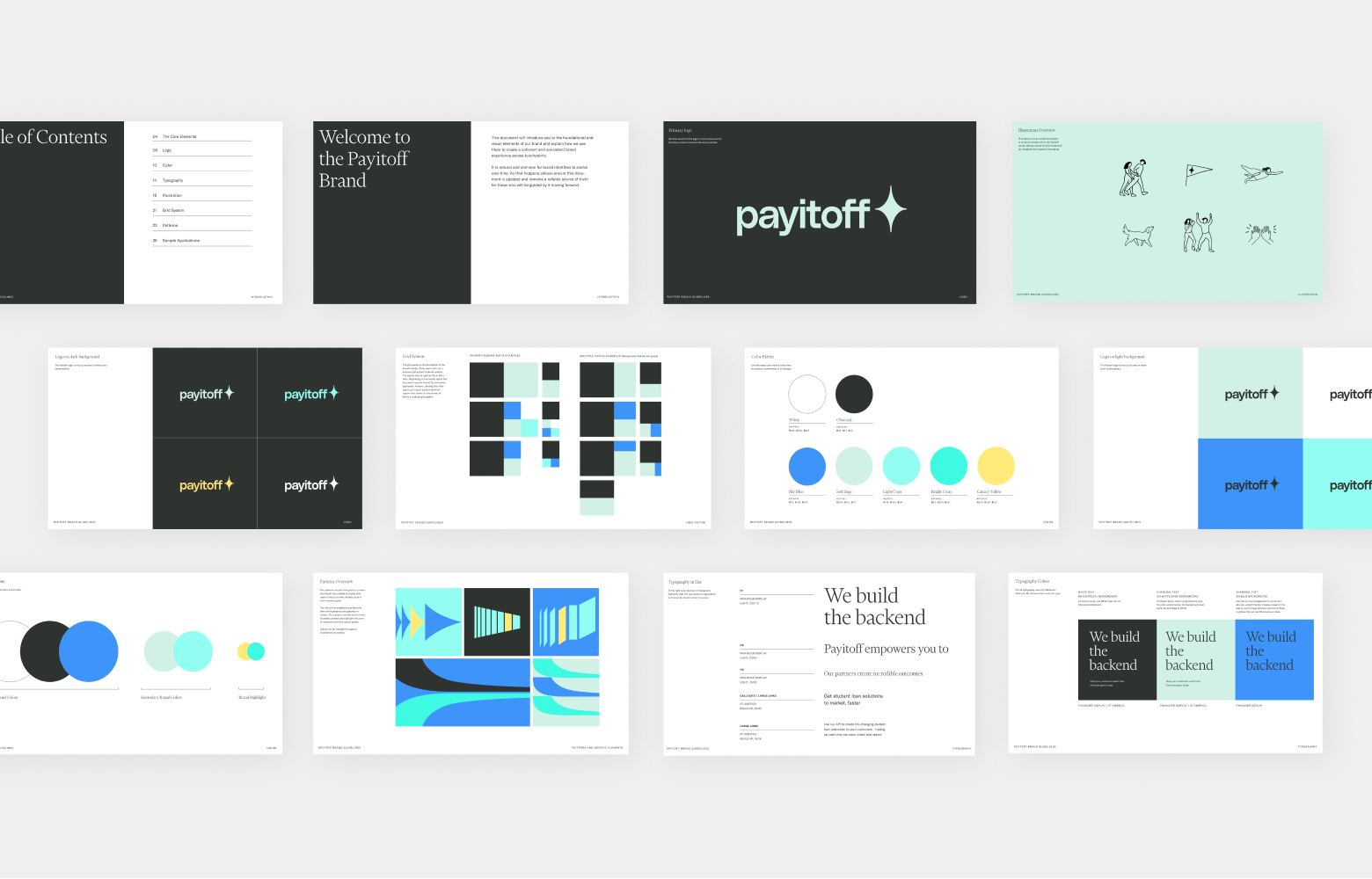


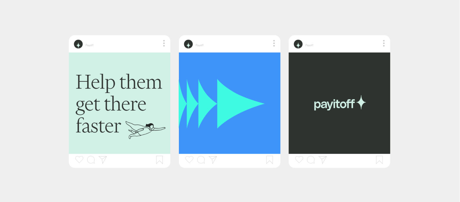
Illustrations act as a small touchpoint or surprise element within the Payitoff brand, adding a sense of playfulness and joy alongside the impactful messaging. They can sometimes be used as celebratory punctuation at the end of a phrase.
The grid system is the foundation; every layout uses a modular system to divide content.
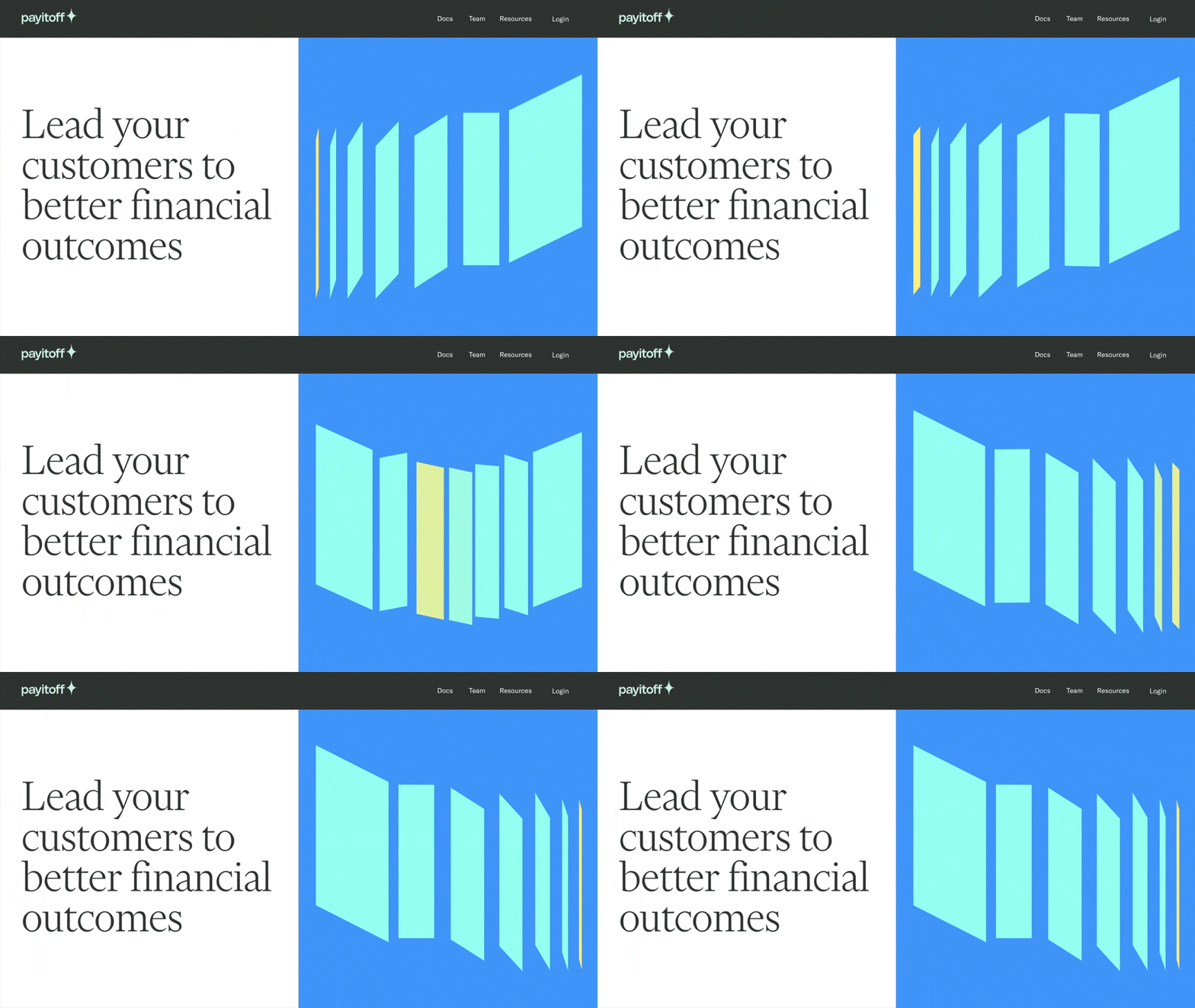

We wanted Payitoff to feel like a catalyst for a healthier financial ecosystem. The use of patterns helps visualize a path to financial success and better borrower outcomes.


Credits
Brand Directors
Vanessa Koch, Kelsey Aroian, Jessica Strelioff
Design Support
Simoul Alva, Cori Corinne, Lauren Michael
Animation
Stina Wahlen